


Colour Palette Checklist for Pattern Designers: 8 Checks Before You Export
You have spent hours on the repeat. The motifs sit neatly, the tile joins cleanly, and the scale feels right. Then the sample comes back and something is off: the sage green has gone muddy, two pinks have merged into one flat block, and the whole design looks washed out next to your screen. Nine times out of ten the problem is colour, not drawing. This is the checklist to run through before you export — whether you are sending a swatch to a client, uploading a digital download or preparing artwork for a print run.
1. Check Contrast Before Anything Else
Squint at your pattern from arm's length. If the shapes blur into an even fog, the contrast is too low, and no amount of lovely colour will rescue it.
The quickest test is to convert the tile to greyscale. Two hues that look wildly different in colour can share the same value, which means the pattern collapses into flat mush on a phone screen, in a distance shot, or on a printed cushion. Going grey reveals the truth in seconds.
If the greyscale version reads clearly, you are most of the way there. If it doesn't, darken the darker colour, lighten the lighter one, or give a motif a defining outline. A contrast ratio of roughly 3:1 between a shape and its ground is a sensible floor for large motifs; fine line work needs considerably more.
2. Are Your Hues Print-Safe?
Vivid screen colours are the single biggest cause of disappointing prints. The CMYK gamut is smaller than what your monitor can display, and the gap bites hardest on:
- Electric and lime greens
- Hot, magenta-leaning pinks
- Deep saturated purples and violets
- Neon oranges and anything fluorescent
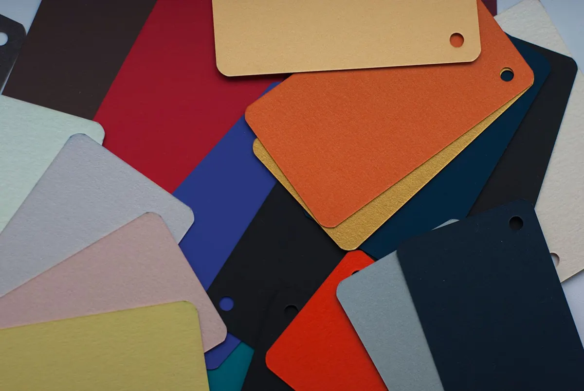
Switch on gamut warning or soft proofing before you export, and pull back any colour that falls outside. A reduction of 10 to 15 per cent in saturation usually keeps the mood of a bright shade while making it printable. Keep a printed swatch book or a set of physical colour cards nearby — screens drift, paper doesn't.
For screen-printed textiles, remember that each colour in the repeat is typically a separate screen. A seven-colour pattern costs more to produce than a five-colour one, so a palette edit can be a commercial decision as much as an aesthetic one.
3. Tonal Balance: Does the Pattern Breathe?
Strip out colour and look at how your light, mid-tone and dark values are distributed. Three problems show up again and again:
- Everything sits in the mid-tones, so the pattern feels flat.
- The darks dominate and the design turns heavy, especially on fabric.
- One tiny accent does all the work, so the repeat looks uneven at a distance.
A useful starting point is roughly 60 per cent dominant, 30 per cent secondary, 10 per cent accent. Treat it as a guide rather than a rule — two-colour patterns can be superb — but it will help you spot a muddled palette. Count your motifs if it helps: if your darkest shade appears on one small element, it will read as a speck, not a statement.
4. Neutrals That Behave in a UK Home
British interiors tend to favour softer, slightly muted neutrals: bone, oatmeal, chalk, warm stone, green-tinged grey, and deeper shades such as navy, charcoal and olive. Cool blue-greys and stark black-and-white can look sharp and contemporary, but they are harder to place in a traditional room and can feel cold across a large upholstered surface.
Two practical points. First, avoid pure white as a large ground unless you know the substrate: on fabric and paper, "white" is usually the base material showing through, and it will not match the crisp white on your screen. An off-white is safer. Second, be cautious with pure black. It rarely prints as a true black and can turn flat or chalky; a very dark charcoal or near-black navy usually looks richer and sits better with the rest of the palette.
If the pattern is destined for a UK client, check it under warm indoor light as well as daylight. The difference between a warm and a cool neutral is far more obvious at eleven at night under a lamp.
5. Test the Repeat, Not Just the Swatch
Colours read differently at different scales. Shrink your repeat to a thumbnail and see whether it turns into visual noise; the culprits are usually a high-contrast pair scattered evenly across the tile. Zoom in and check the tile edges for accidental stripes, where a dark motif meets a light ground at every join. Half-drop and brick arrangements can make a colour flicker or pool in ways a straight repeat hides.
Watch for colour pooling too: clusters of the same hue collecting in one corner while the rest of the tile looks thin. Often the fix is redistributing a few motifs rather than changing the palette at all.
Print a test at the size the pattern will actually be used — a cushion front, a metre of wallpaper, a phone case — and pin it up. Almost every colour problem looks worse on a screen than it does in the hand.
6. Don't Rely on Colour Alone
Colour vision deficiency affects roughly one in twelve men and one in two hundred women, so a fair share of your audience will not see your palette the way you do. That is not a reason to avoid colour; it is a reason to make sure structure carries the design.
Check that every motif is distinguishable in greyscale, that no key element is defined purely by a red-green or blue-yellow difference, and that any pattern with directional flow still reads once hue is removed. If you are building a collection a customer will match to their existing decor, add a plain tonal coordinate alongside the busy repeat. It makes the range easier to use and easier to sell.
7. Housekeeping Before You Export
- Confirm the colour mode: CMYK for anything going to print, sRGB for digital downloads and screen products.
- Ask the printer which profile they want. FOGRA39 is a common European standard, but not every printer uses it.
- Hunt for stray colours. Copy-paste and imported artwork often leave behind a shade or two that isn't in your palette.
- Check transparencies, overprints and drop shadows, which can behave unpredictably once converted.
- Supply a palette sheet with hex, RGB and CMYK values so a client or manufacturer can match your intentions.
- Save a flat reference image of the final tile and name your files clearly.
Make It a Five-Minute Habit
Greyscale check, gamut check, thumbnail check, print check. Four moves, a few minutes each, and they catch nearly every colour problem that reaches sample stage.
Set up a template file with your usual checks built in, keep a palette swatch you trust, and hold on to a small printed reference you can compare against the screen. Your colour judgement improves fastest when there is something physical to judge it by — and clients notice when the samples come back right first time.
Photo: Olga Kovalski / Pexels