

Beginner's Guide to Choosing Wallpaper for a Small UK Room
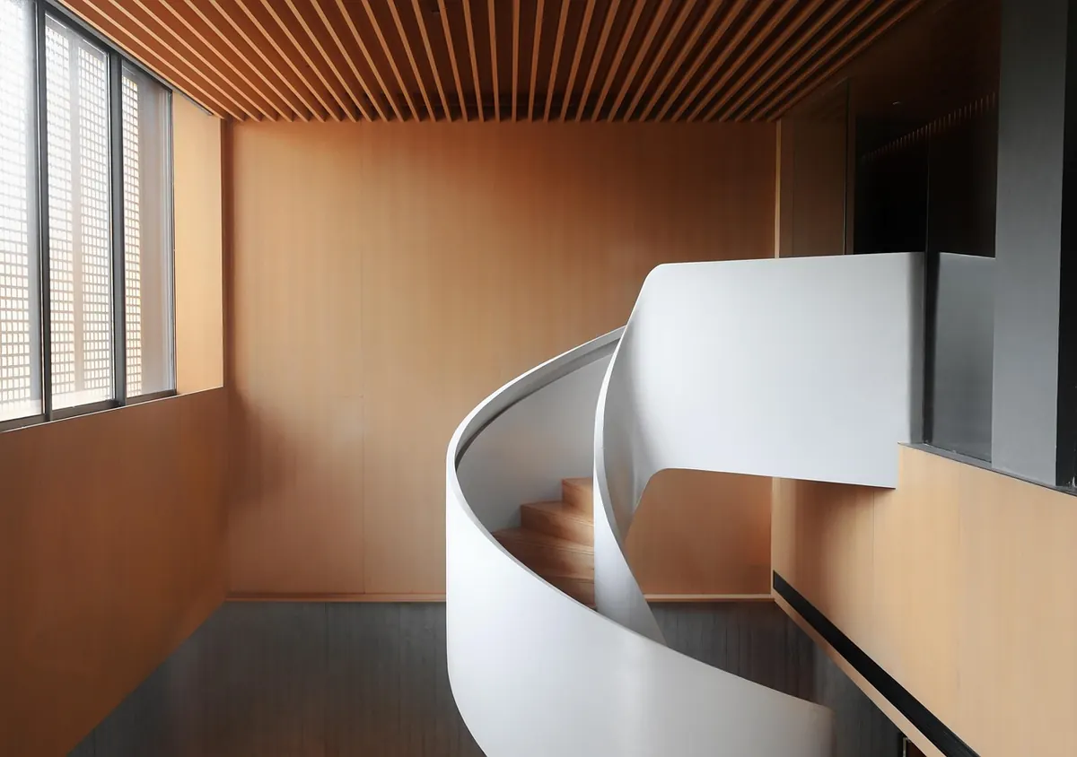
A box room, a narrow hallway, a bathroom carved out of a back bedroom: compact spaces are where British homes do their hardest work. They also tend to have one modest window, a ceiling that feels closer than it is, and walls that have been painted over so many times they have developed a personality of their own. Wallpaper can give that kind of room shape and warmth. Chosen badly, the same room will feel like a cupboard lined with someone else’s curtains.
What follows is the order of decisions that actually matters — light, scale, direction, substrate, and the paste question — rather than a list of pretty patterns.
Start With the Light, Not the Pattern
A north-facing back bedroom with a sash window gives cool, flat light all day, and colours read greyer and deeper than they did in the shop. A small south-facing room can take a stronger colour, because sunlight lifts it. The common mistake is choosing at the wrong time of day, usually under shop lighting at four in the afternoon.
Order samples and tape them to two walls, not one — a corner shows you how the paper behaves where light falls off. Look at them at breakfast, mid-afternoon, and under the lamp you actually use in the evening. Anything that works in all three is the one. Finish matters as much as colour: a paper with a slight sheen bounces light into a dark corner, while a flat matte absorbs it and gives depth.
Scale: Which Pattern Size Suits a Small Room
The instinct is to reach for a small pattern, and sometimes that is right. A fine tonal motif — a tiny sprig or a narrow stripe in two shades of one colour — wraps the walls without demanding attention, and it is forgiving on walls that are not perfectly flat. In a windowless cloakroom or an under-stairs WC, it is often the best answer available.
But small and busy is not the same as small and quiet. A dense, high-contrast print on four walls tires the eye fast in a room you sit in every day.
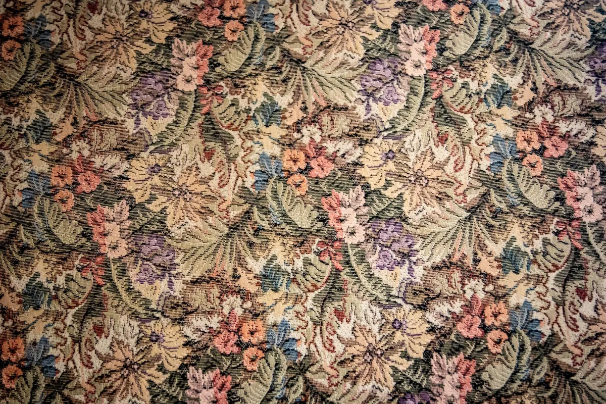
A more useful rule: judge the scale against the largest object in the room, not the room itself. Beside a king-size bed or a run of fitted wardrobes, a dainty print looks lost. A motif roughly the size of your hand, or larger, used on one or two walls, will hold its own behind furniture and give the room a focal point. Deep or saturated colour throughout can work too — it blurs the corners and makes a small room feel enveloping rather than mean, provided the light is reasonable and the ceiling stays pale.
Pattern Direction and How It Moves the Eye
Stripes and trailing florals are vertical by nature, and they carry the eye upwards — helpful under a low ceiling. Wide horizontal bands or a strongly horizontal trellis will make a narrow room read as broader. Diagonal trellis and small geometric repeats add energy without obvious direction, which is why they are so common in hallways and downstairs loos.
In period homes, a dado or picture rail gives you a natural stopping point. Papering above the rail and painting below in a colour pulled from the paper can make a small room feel taller and more considered than papering every surface. Running the same paper across the ceiling is a bolder move, but it can work in a tight space if the print is quiet: it removes the visual lid and makes the room feel whole.
One practical check before ordering: some designs have a definite up and down. Hang one sidewise and everyone will notice, even if they cannot say why.
Old Walls, Small Rooms
British housing stock is unforgiving. Victorian terraces with solid brick walls, 1930s semis, post-war builds where nothing is quite plumb. In a small room, every quirk sits closer to your eye. Before any paper goes up, expect filler, a sanding block and lining paper hung horizontally to level the surface. Skip that stage and every bump will show through a pale paper.
Damp deserves its own paragraph. Small rooms are often the ones with a cold external wall, a blocked air brick, or an extractor fan that has never worked properly. Wallpaper over damp will stain and lift, and no pattern hides it for long. Deal with the cause first; if you are not sure what the cause is, it is worth paying a professional to look before you decorate, because re-hanging a wall later costs more than the inspection.
Paste-the-Wall or Paste-the-Paper?
- Paste-the-wall. Paste goes on the wall, the paper stays dry. No pasting table, no soaking, and you can slide a drop into position before it grabs. In a small room with a chimney breast, an alcove and two door frames, that working time is worth a great deal. It needs a clean, sealed surface — paste on dusty old plaster will not hold — so a primer coat is usually part of the job.
- Paste-the-paper. Traditional, generally cheaper, and the paper needs time to relax before hanging. Long drops need two people and a table, which is awkward in a room the size of a landing.
- Pre-pasted. Soaked briefly and hung wet. Fine for small areas and simple patterns, less pleasant with a large repeat.
- Peel-and-stick. Convenient on smooth painted walls and popular with renters, but check the manufacturer’s guidance. Most are not designed for old, uneven plaster or the humidity of a small bathroom.
Measuring, Repeats and Wastage
Work out the number of rolls before you commit to anything. Measure wall height and width, then look up the pattern repeat and the match type — this is printed on the label or listed with the sample.
- Straight match: each drop lines up with the previous one at the same point. The easiest to hang.
- Offset (half-drop) match: alternate drops step down by half the repeat, so you need to cut more carefully.
- Random match: no alignment needed, and the least wasteful.
A large repeat wastes more paper, and in a room where you might only need two or three rolls, that wastage matters proportionally. Buy every roll in one batch — the shade number is printed on the label — and keep a spare stored flat, because a patch in five years’ time will not match a different batch.
A Practical Order of Decisions
Work through it in this sequence and the choices stop competing with each other:
- Note the light and how the room is used, from morning to evening.
- Measure properly, including the repeat, and calculate rolls.
- Choose the scale against the biggest object in the room.
- Decide the format — paste-the-wall if you are working alone, paste-the-paper if you have help and a table.
- Order samples, tape them up, and live with them for a few days.
- Prep the walls: filler, sanding, lining paper, and the right primer if you are pasting the wall.
A small room rewards restraint. One confident decision — a bold motif on the chimney breast, a deep green above the dado, a quiet tonal print on all four walls — will do more for the space than three cautious half-measures. Decide what the room’s job is, then let the paper do that one thing well.
Photo: zhangliams / Pixabay